
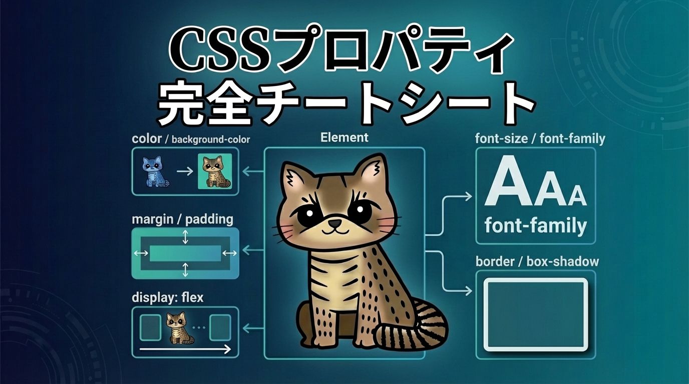
CSSプロパティ 完全チートシート【日本語・2026年最新版】一覧・CSSショートハンドもまとめ!
📖 CSSプロパティとは
CSS(Cascading Style Sheets)は、HTMLやXMLなどのマークアップ言語で記述された文書の見た目を制御するためのスタイルシート言語です。CSSプロパティは、要素の色、サイズ、位置、レイアウト、アニメーションなど、あらゆる視覚的な表現を制御するための設定項目です。
このチートシートでは、最新のCSS仕様に基づいた主要なプロパティを、カテゴリ別に整理し、実践的な例と図解を交えて解説します。各プロパティの基本的な使い方から、ショートハンド(短縮記法)まで、実務で役立つ情報を網羅しています。
:
値
;
📐 レイアウトプロパティ
display
display: block | inline | inline-block | flex | grid | table | none | contents | flow-root | ...;
このプロパティは、要素の表示形式を決定する最も重要なプロパティです。要素がどのようにレンダリングされるかを制御し、他の多くのプロパティの動作に影響を与えます。
block:要素はブロックレベル要素として表示されます。幅いっぱいに広がり、前後に改行が入ります。例:div, p, h1-h6
inline:要素はインライン要素として表示されます。コンテンツの幅だけを占有し、横に並べることができます。例:span, a, em
inline-block:インライン要素のように横に並べられますが、ブロック要素のように幅・高さ・マージン・パディングを設定できます。
flex / grid:FlexboxやGrid Layoutを使用するための値です。モダンなレイアウト手法の基礎となります。
none:要素を完全に非表示にします。DOMには存在しますが、レンダリングされません。
block
inline
Inline 2
inline-block
position
position: static | relative | absolute | fixed | sticky;
このプロパティは、要素の配置方法を決定します。top, right, bottom, leftプロパティと組み合わせて使用することで、要素を自由な位置に配置できます。
static(デフォルト):通常のドキュメントフローに従って配置されます。top, right, bottom, leftは無効です。
relative:通常の位置を基準として、top, right, bottom, leftで相対的に移動できます。元の位置のスペースは保持されます。
absolute:最も近いpositionedな祖先要素(relative, absolute, fixed, sticky)を基準として配置されます。ドキュメントフローから外れます。
fixed:ビューポート(画面)を基準として配置されます。スクロールしても位置が固定されます。
sticky:スクロール位置に応じて、relativeとfixedの間を切り替えます。指定した位置まで来ると固定されます。
relative
absolute
fixed
top / right / bottom / left
top: <length> | <percentage> | auto;
right: <length> | <percentage> | auto;
bottom: <length> | <percentage> | auto;
left: <length> | <percentage> | auto;
これらのプロパティは、positionプロパティがstatic以外の値の場合に、要素の位置を指定します。基準点からの距離を設定します。
ショートハンド:insetプロパティを使用することで、4方向を一括で指定できます。inset: 10px;(全方向)、inset: 10px 20px;(上下 左右)、inset: 10px 20px 30px 40px;(上 右 下 左)
inset: 10px
inset: 10px 30px
z-index
z-index: <integer> | auto;
このプロパティは、重なり順(スタッキングコンテキスト)を制御します。値が大きいほど前面に表示されます。positionプロパティがstatic以外の場合のみ有効です。
z-index: 1, 2, 3
float / clear
float: left | right | none;
clear: left | right | both | none;
floatプロパティは、要素を左または右に浮動させ、周囲のコンテンツがその周りに回り込むようにします。clearプロパティは、浮動要素の影響を解除します。
⚠️ 注意:モダンなレイアウトでは、FlexboxやGridを使用することが推奨されます。floatは主に画像の回り込みなど、特定の用途に限定して使用してください。
float: left
このテキストは浮動要素の周りに回り込みます。浮動要素は左側に配置され、テキストがその周りに流れます。
float: right
このテキストは浮動要素の周りに回り込みます。浮動要素は右側に配置され、テキストがその周りに流れます。
overflow
overflow: visible | hidden | scroll | auto | clip;
このプロパティは、要素のコンテンツがボックスからはみ出した場合の処理方法を指定します。
visible(デフォルト):コンテンツがはみ出しても表示されます。
hidden:はみ出した部分を切り取ります。
scroll:常にスクロールバーを表示します。
auto:必要に応じてスクロールバーを表示します。
ショートハンド:overflow: hidden;はoverflow-x: hidden; overflow-y: hidden;のショートハンドです。個別に指定する場合は、overflow-xとoverflow-yを使用します。
overflow: visible
overflow: hidden
overflow: scroll
visibility
visibility: visible | hidden | collapse;
このプロパティは、要素の可視性を制御します。display: noneと異なり、要素はレイアウトスペースを保持します。
visible(デフォルト):要素は表示されます。
hidden:要素は非表示になりますが、レイアウトスペースは保持されます。
collapse:テーブルの行や列に使用されます。レイアウトスペースを保持しません。
📦 ボックスモデルプロパティ
width / height
width: <length> | <percentage> | auto | fit-content | min-content | max-content;
height: <length> | <percentage> | auto | fit-content | min-content | max-content;
これらのプロパティは、要素の幅と高さを指定します。ボックスモデルの最も基本的なプロパティです。
fit-content:コンテンツに合わせてサイズを調整しますが、利用可能なスペースを超えることはありません。
min-content / max-content:コンテンツの最小/最大サイズに基づいてサイズを決定します。
width: 200px
width: 50%
width: fit-content
margin
margin: <length> | <percentage> | auto;
margin: <top> <right> <bottom> <left>;
margin-top / margin-right / margin-bottom / margin-left
このプロパティは、要素の外側の余白(マージン)を指定します。要素間の間隔を調整するために使用されます。
ショートハンド:margin: 10px;(全方向)、margin: 10px 20px;(上下 左右)、margin: 10px 20px 30px;(上 左右 下)、margin: 10px 20px 30px 40px;(上 右 下 左)
auto:水平方向のマージンにautoを指定すると、要素を中央揃えできます。
margin: 10px
margin: 10px 30px
margin: 0 auto (中央揃え)
padding
padding: <length> | <percentage>;
padding: <top> <right> <bottom> <left>;
padding-top / padding-right / padding-bottom / padding-left
このプロパティは、要素の内側の余白(パディング)を指定します。コンテンツとボーダーの間のスペースを制御します。
ショートハンド:marginと同様に、1〜4つの値で指定できます。
padding: 10px
padding: 10px 30px
padding: 10px 20px 30px 40px
border
border: <width> <style> <color>;
border-width / border-style / border-color
border-top / border-right / border-bottom / border-left
このプロパティは、要素の境界線(ボーダー)を指定します。幅、スタイル、色を一括で設定できます。
border-style:solid(実線)、dashed(破線)、dotted(点線)、double(二重線)、none(なし)など
ショートハンド:border: 2px solid #000;のように、幅、スタイル、色を順に指定します。
border: 2px solid
border: 2px dashed
border: 2px dotted
border: 4px double
border-radius
border-radius: <length> | <percentage>;
border-radius: <top-left> <top-right> <bottom-right> <bottom-left>;
border-top-left-radius / border-top-right-radius / border-bottom-right-radius / border-bottom-left-radius
このプロパティは、要素の角を丸くします。モダンなデザインで頻繁に使用されるプロパティです。
ショートハンド:border-radius: 10px;(全角)、border-radius: 10px 20px;(左上・右下 右上・左下)、border-radius: 10px 20px 30px 40px;(左上 右上 右下 左下)
border-radius: 10px
border-radius: 20px
border-radius: 50% (円)
border-radius: 10px 30px
box-sizing
box-sizing: content-box | border-box;
このプロパティは、widthとheightの計算方法を決定します。モダンなCSSでは、border-boxを使用することが推奨されます。
content-box(デフォルト):widthとheightはコンテンツ領域のみを指定します。paddingとborderは追加されます。
border-box:widthとheightは、paddingとborderを含めた全体のサイズを指定します。より直感的で管理しやすいです。
content-box (width: 200px)
+ padding: 20px
+ border: 5px
= 250px
border-box (width: 200px)
(padding + border 含む)
= 200px

✍️ タイポグラフィプロパティ
font
font: [<font-style> || <font-variant> || <font-weight>] <font-size> [/<line-height>] <font-family>;
このプロパティは、フォント関連のプロパティを一括で指定するショートハンドです。font-style, font-variant, font-weight, font-size, line-height, font-familyをまとめて設定できます。
例:font: italic bold 16px/1.5 'Arial', sans-serif;
font: 16px Arial
font: 16px Arial
font: italic bold 20px/1.5 serif
font: italic bold 20px/1.5 serif
font-family
font-family: <family-name> | <generic-family> [, <family-name> | <generic-family>]*;
このプロパティは、フォントファミリー(フォントの種類)を指定します。複数のフォントを指定することで、フォールバックを設定できます。
generic-family:serif(セリフ)、sans-serif(サンセリフ)、monospace(等幅)、cursive(筆記体)、fantasy(装飾)
serif
The quick brown fox jumps over the lazy dog.
sans-serif
The quick brown fox jumps over the lazy dog.
monospace
The quick brown fox jumps over the lazy dog.
font-size
font-size: <length> | <percentage> | <absolute-size> | <relative-size>;
このプロパティは、フォントのサイズを指定します。px, em, rem, %, vw, vhなどの単位が使用できます。
rem:ルート要素(html)のフォントサイズを基準とします。レスポンシブデザインで推奨される単位です。
em:親要素のフォントサイズを基準とします。
font-size: 12px
12px – Small text
font-size: 16px
16px – Medium text
font-size: 24px
24px – Large text
font-weight
font-weight: normal | bold | bolder | lighter | 100 | 200 | ... | 900;
このプロパティは、フォントの太さを指定します。100(最も細い)から900(最も太い)までの数値、またはキーワードで指定します。
font-weight: 300
Light (300)
font-weight: 400 (normal)
Normal (400)
font-weight: 700 (bold)
Bold (700)
text-align
text-align: left | right | center | justify | start | end;
このプロパティは、テキストの水平方向の配置を指定します。
text-align: left
左揃えのテキストです。通常の読み方向に従って配置されます。
text-align: center
中央揃えのテキストです。見出しなどでよく使用されます。
text-align: right
右揃えのテキストです。特定のレイアウトで使用されます。
text-align: justify
両端揃えのテキストです。行の両端が揃うように調整されます。
line-height
line-height: normal | <number> | <length> | <percentage>;
このプロパティは、行の高さ(行間)を指定します。読みやすさに大きく影響する重要なプロパティです。
推奨値:1.5〜1.8程度が読みやすいとされています。数値で指定すると、フォントサイズに対する倍率になります。
line-height: 1.2
line-height: 1.2 – 行間が狭いテキストです。コンパクトなレイアウトに適しています。
line-height: 1.6
line-height: 1.6 – 標準的な行間のテキストです。読みやすさとバランスが良いです。
line-height: 2
line-height: 2 – 行間が広いテキストです。余裕のあるレイアウトに適しています。
text-decoration
text-decoration: none | underline | overline | line-through | blink;
このプロパティは、テキストの装飾線を指定します。下線、上線、取り消し線などを設定できます。
ショートハンド:text-decoration: underline;はtext-decoration-line: underline;のショートハンドです。詳細な制御には、text-decoration-line、text-decoration-color、text-decoration-style、text-decoration-thicknessを使用します。
text-decoration: underline
Underline text
text-decoration: overline
Overline text
text-decoration: line-through
Line-through text
text-transform
text-transform: none | uppercase | lowercase | capitalize | full-width;
このプロパティは、テキストの大文字・小文字の変換を指定します。
text-transform: uppercase
Uppercase Text
text-transform: lowercase
Lowercase Text
text-transform: capitalize
capitalize text
letter-spacing / word-spacing
letter-spacing: normal | <length>;
word-spacing: normal | <length>;
letter-spacingは文字間の間隔、word-spacingは単語間の間隔を指定します。
letter-spacing: 2px
Letter Spacing
word-spacing: 10px
Word Spacing Example
🎨 色と背景プロパティ
color
color: <color>;
このプロパティは、テキストの色を指定します。前景色を設定するプロパティです。
色の指定方法:キーワード(red, blue)、16進数(#ff0000)、RGB(rgb(255, 0, 0))、RGBA(rgba(255, 0, 0, 0.5))、HSL(hsl(0, 100%, 50%))など
color: #6366f1
Primary Color
color: #ec4899
Secondary Color
color: #10b981
Accent Color
background
background: [<bg-color>] [<bg-image>] [<bg-position>] / [<bg-size>] [<bg-repeat>] [<bg-attachment>] [<bg-origin>] [<bg-clip>];
このプロパティは、背景関連のプロパティを一括で指定するショートハンドです。background-color, background-image, background-position, background-size, background-repeat, background-attachmentなどをまとめて設定できます。
例:background: #fff url('image.jpg') center/cover no-repeat;
background: linear-gradient
background: radial-gradient
background: repeating-linear-gradient
background-color
background-color: <color> | transparent;
このプロパティは、要素の背景色を指定します。backgroundショートハンドの一部としても使用できます。
background-color: #6366f1
background-color: #ec4899
background-color: rgba(16, 185, 129, 0.5)
background-image
background-image: none | <image> | <gradient>;
このプロパティは、要素の背景画像を指定します。画像ファイルのURL、またはグラデーションを指定できます。
グラデーション:linear-gradient(), radial-gradient(), conic-gradient()などの関数を使用できます。
background-size
background-size: auto | <length> | <percentage> | cover | contain;
このプロパティは、背景画像のサイズを指定します。
cover:背景画像が要素全体を覆うように拡大・縮小されます。アスペクト比を維持します。
contain:背景画像が要素内に完全に収まるように拡大・縮小されます。
opacity
opacity: <number> | <percentage>;
このプロパティは、要素全体の不透明度を指定します。0(完全に透明)から1(完全不透明)までの値を指定します。
opacity: 1
opacity: 0.5
opacity: 0.2
✨ 変形とアニメーションプロパティ
transform
transform: none | <transform-function>+;
このプロパティは、要素を変形させます。回転、拡大縮小、移動、傾斜などの変形を適用できます。
主な関数:translate()(移動)、rotate()(回転)、scale()(拡大縮小)、skew()(傾斜)、matrix()(行列変換)
transform: translate(20px, 10px)
transform: rotate(45deg)
transform: scale(1.2)
transform: skew(20deg)
transition
transition: <property> <duration> [<timing-function>] [<delay>];
transition: all <duration> [<timing-function>] [<delay>];
このプロパティは、プロパティの変化をアニメーション化します。スムーズなトランジション効果を実現できます。
ショートハンド:transition: all 0.3s ease;のように、プロパティ、継続時間、タイミング関数、遅延時間を指定します。
タイミング関数:ease(デフォルト)、linear、ease-in、ease-out、ease-in-out、cubic-bezier()
transition: all 0.3s
transition: transform 0.5s ease
animation
animation: <name> <duration> [<timing-function>] [<delay>] [<iteration-count>] [<direction>] [<fill-mode>] [<play-state>];
このプロパティは、@keyframesで定義したアニメーションを適用します。より複雑なアニメーション効果を実現できます。
ショートハンド:animation: slideIn 1s ease-in-out infinite;のように、名前、継続時間、タイミング関数、遅延、繰り返し回数、方向、フィルモード、再生状態を指定します。
animation: pulse
animation: bounce
animation: rotate
📐 Flexboxプロパティ
Flexboxは、1次元のレイアウトを効率的に配置するための強力なCSSモジュールです。詳細な解説は別のチートシートを参照してください。ここでは主要なプロパティを簡潔に紹介します。
display: flex
display: flex | inline-flex;
Flexboxコンテナを作成します。
flex
flex: [<flex-grow> <flex-shrink>? || <flex-basis>];
flex-grow, flex-shrink, flex-basisのショートハンドです。最もよく使用されるFlexboxプロパティです。
よく使われる値:flex: 1;(等幅分配)、flex: 0 0 200px;(固定幅)、flex: none;(サイズ固定)
justify-content / align-items
justify-content: flex-start | flex-end | center | space-between | space-around | space-evenly;
align-items: flex-start | flex-end | center | baseline | stretch;
主軸方向と交差軸方向の配置を制御します。
🔲 Grid Layoutプロパティ
display: grid
display: grid | inline-grid;
Grid Layoutコンテナを作成します。2次元のレイアウトを効率的に配置できます。
display: grid
grid-template-columns / grid-template-rows
grid-template-columns: none | <track-list>;
grid-template-rows: none | <track-list>;
グリッドの列と行のサイズを定義します。
例:grid-template-columns: 1fr 2fr 1fr;(3列、中央が2倍幅)、grid-template-columns: repeat(3, 1fr);(3列、等幅)
grid-template-columns: 1fr 2fr 1fr
gap
gap: <row-gap> <column-gap>?;
row-gap / column-gap
グリッドアイテム間の間隔を指定します。Flexboxでも使用できます。
gap: 20px
grid-area
grid-area: <row-start> / <column-start> / <row-end> / <column-end>;
グリッドアイテムの配置領域を指定します。grid-rowとgrid-columnのショートハンドです。
🚀 最新機能プロパティ
aspect-ratio
aspect-ratio: auto | <ratio>;
このプロパティは、要素のアスペクト比(幅と高さの比率)を指定します。レスポンシブな画像や動画のコンテナに便利です。
例:aspect-ratio: 16 / 9;(16:9の比率)、aspect-ratio: 1;(正方形)
aspect-ratio: 16 / 9
aspect-ratio: 1
aspect-ratio: 4 / 3
object-fit
object-fit: fill | contain | cover | none | scale-down;
このプロパティは、置換要素(img, videoなど)がコンテナ内でどのようにサイズ調整されるかを指定します。
cover:アスペクト比を維持しながら、コンテナ全体を覆います。
contain:アスペクト比を維持しながら、コンテナ内に完全に収めます。
filter
filter: none | <filter-function>+;
このプロパティは、要素に視覚効果(ぼかし、明るさ調整、色相変更など)を適用します。
主な関数:blur()(ぼかし)、brightness()(明るさ)、contrast()(コントラスト)、grayscale()(グレースケール)、hue-rotate()(色相回転)、saturate()(彩度)
filter: blur(5px)
filter: grayscale(100%)
filter: brightness(1.5)
backdrop-filter
backdrop-filter: none | <filter-function>+;
このプロパティは、要素の背後にあるコンテンツに視覚効果を適用します。ガラスモーフィズム(Glassmorphism)デザインに使用されます。
backdrop-filter: blur(10px)
clip-path
clip-path: none | <clip-source> | <basic-shape> | <geometry-box>;
このプロパティは、要素の表示領域をクリッピング(切り抜き)します。複雑な形状を作成できます。
例:clip-path: circle(50%);(円形)、clip-path: polygon(0 0, 100% 0, 50% 100%);(三角形)
clip-path: circle(50%)
clip-path: polygon
scroll-snap-type / scroll-snap-align
scroll-snap-type: none | [x | y | both] [mandatory | proximity];
scroll-snap-align: none | start | center | end;
これらのプロパティは、スクロール時のスナップ動作を制御します。カルーセルやスライダーに便利です。
container queries (container-type, container-name)
container-type: normal | size | inline-size;
container-name: <name>;
@container <name> (<condition>) { ... }
コンテナクエリは、要素の親コンテナのサイズに基づいてスタイルを適用する機能です。レスポンシブデザインの新たなアプローチです。
⚠️ ブラウザ対応:比較的新しい機能のため、ブラウザ対応を確認してください。