
Tailwind CSS 完全チートシート【日本語・2026年最新版】≪テイルウインド≫
📖 Tailwind CSSとは
Tailwind CSSは、ユーティリティファーストのCSSフレームワークです。従来のコンポーネントベースのフレームワークとは異なり、低レベルのユーティリティクラスを組み合わせて、カスタムデザインを素早く構築できます。
Tailwind CSSの最大の特徴は、クラス名がそのままCSSプロパティを表現していることです。例えば、bg-blue-500は背景色を青に、p-4はパディングを1remに設定します。これにより、HTMLとCSSを行き来することなく、HTMLファイル内で直接スタイリングが可能になります。
1 2 3 | <div class="bg-blue-500 text-white p-4 rounded-lg"> こんにちは、Tailwind CSS! </div> |
主な利点:
- ⚡ 高速な開発:クラスを組み合わせるだけでスタイリング可能
- 🎨 柔軟性:カスタムデザインを簡単に実現
- 📱 レスポンシブ:プレフィックスで簡単にレスポンシブ対応
- 🎯 保守性:ユーティリティクラスで一貫性のあるデザイン
- 🚀 パフォーマンス:使用したクラスのみが最終CSSに含まれる
🎯 重要な概念:ユーティリティクラス
Tailwind CSSは、小さな単一責任のユーティリティクラスを提供します。これらのクラスを組み合わせることで、複雑なデザインを構築します。従来のCSSでは、各要素にカスタムクラスを定義し、別のCSSファイルでスタイルを記述する必要がありましたが、Tailwind CSSでは、HTML内で直接スタイリングが可能です。
従来のCSS
1 2 3 4 5 6 | .button{ background-color:#3b82f6; color:white; padding:1rem; border-radius:0.5rem; } |
Tailwind CSS
1 2 3 4 | <button class="bg-blue-500 text-white p-4 rounded-lg"> ボタン </button> |
💡 ヒント:Tailwind CSSのクラス名は、CSSプロパティと値の組み合わせを直感的に表現しています。bg-blue-500は「background-color: blue-500」、p-4は「padding: 1rem」を意味します。この命名規則により、クラス名を見るだけでスタイルが理解できます。
📦 レイアウト
Display(表示方法)
block | inline-block | inline | flex | inline-flex | grid | inline-grid | table | hidden
要素の表示方法を制御します。CSSのdisplayプロパティに対応しています。
block
ブロック要素2
inline-block
インラインブロック2
flex
grid
hidden
Position(位置指定)
static | fixed | absolute | relative | sticky
要素の位置指定方法を制御します。通常はrelativeやabsoluteと組み合わせて、top-*、right-*、bottom-*、left-*クラスと一緒に使用します。
relative + top-4 left-4
fixed(画面固定)
※実際には画面右下に固定されます
sticky
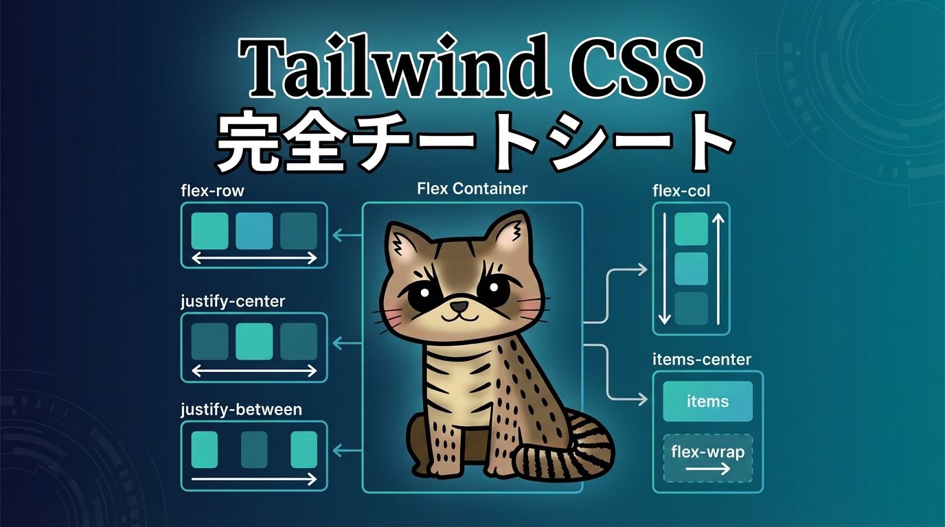
Flexbox(フレックスボックス)
flex | flex-col | flex-wrap | justify-* | items-* | gap-*
Flexboxレイアウトを簡単に実現できます。主軸方向の配置はjustify-*、交差軸方向の配置はitems-*で制御します。
justify-start
justify-center
justify-between
items-center
flex-col
flex-wrap
Grid(グリッドレイアウト)
grid | grid-cols-* | grid-rows-* | gap-* | col-span-* | row-span-*
CSS Grid Layoutを簡単に使用できます。列数や行数を指定し、アイテムの配置を柔軟に制御できます。
grid-cols-3
col-span-2
grid-cols-1 md:grid-cols-2 lg:grid-cols-4
※画面サイズに応じて列数が変わります
Width & Height(幅と高さ)
w-* | h-* | min-w-* | max-w-* | min-h-* | max-h-*
要素の幅と高さを制御します。数値は0.25rem単位(4px単位)で、w-4は1rem(16px)、w-fullは100%を意味します。
w-1/2, w-1/3, w-1/4
w-full
h-20, h-32, h-40
max-w-md, max-w-lg, max-w-xl
📏 スペーシング
Padding(内側の余白)
p-* | px-* | py-* | pt-* | pr-* | pb-* | pl-*
要素の内側の余白を設定します。p-4は全方向、px-4は左右、py-4は上下のパディングを意味します。
p-2, p-4, p-8
px-4 py-2
pt-4 pb-2 pl-8 pr-2
スケール表
| クラス | 値 | ピクセル |
|---|---|---|
| p-0 | 0 | 0px |
| p-1 | 0.25rem | 4px |
| p-2 | 0.5rem | 8px |
| p-4 | 1rem | 16px |
| p-8 | 2rem | 32px |
| p-16 | 4rem | 64px |
Margin(外側の余白)
m-* | mx-* | my-* | mt-* | mr-* | mb-* | ml-* | -m-*
要素の外側の余白を設定します。負の値も使用でき、-m-4のようにマイナス記号を付けることで、要素を引き寄せることができます。
m-4
mx-auto(中央揃え)
-m-4(負のマージン)
Gap(間隔)
gap-* | gap-x-* | gap-y-*
FlexboxやGridコンテナ内のアイテム間の間隔を設定します。gap-4は全方向、gap-x-4は水平方向、gap-y-4は垂直方向の間隔を意味します。
gap-2
gap-8
gap-x-4 gap-y-2

✍️ タイポグラフィ
Font Size(フォントサイズ)
text-xs | text-sm | text-base | text-lg | text-xl | text-2xl | text-3xl | text-4xl | text-5xl | text-6xl | text-7xl | text-8xl | text-9xl
テキストのサイズを制御します。レスポンシブなサイズ指定も可能で、md:text-2xlのようにブレークポイントを指定できます。
text-xs – 0.75rem (12px)
text-sm – 0.875rem (14px)
text-base – 1rem (16px)
text-lg – 1.125rem (18px)
text-xl – 1.25rem (20px)
text-2xl – 1.5rem (24px)
text-3xl – 1.875rem (30px)
text-4xl – 2.25rem (36px)
text-5xl – 3rem (48px)
Font Weight(フォントの太さ)
font-thin | font-extralight | font-light | font-normal | font-medium | font-semibold | font-bold | font-extrabold | font-black
テキストの太さを制御します。数値は100単位で、font-thinは100、font-boldは700に対応します。
font-thin (100) – 細い
font-light (300) – 軽い
font-normal (400) – 通常
font-medium (500) – 中
font-semibold (600) – やや太い
font-bold (700) – 太い
font-extrabold (800) – とても太い
font-black (900) – 最も太い
Text Align(テキストの配置)
text-left | text-center | text-right | text-justify
テキストの水平方向の配置を制御します。
text-left
左揃えのテキストです。日本語の文章がどのように表示されるか確認できます。
text-center
中央揃えのテキストです。見出しなどでよく使用されます。
text-right
右揃えのテキストです。数値や日付の表示に適しています。
Text Color(テキストの色)
text-{color}-{shade} | text-gray-500 | text-blue-600 | text-red-400
テキストの色を設定します。カラーパレットは50から950まで、50単位で設定できます。
基本色
text-red-500
text-blue-500
text-green-500
text-yellow-500
text-purple-500
text-pink-500
色の濃淡
text-gray-300(薄い)
text-gray-500(中)
text-gray-700(濃い)
text-gray-900(最も濃い)
Line Height(行の高さ)
leading-none | leading-tight | leading-snug | leading-normal | leading-relaxed | leading-loose
テキストの行間を制御します。読みやすさに大きく影響する重要なプロパティです。
leading-tight
行間が狭いテキストです。見出しなどで使用されます。複数行のテキストで行間の違いを確認できます。
leading-normal
通常の行間のテキストです。本文などで使用されます。複数行のテキストで行間の違いを確認できます。
leading-loose
行間が広いテキストです。読みやすさを重視する場合に使用されます。複数行のテキストで行間の違いを確認できます。
Text Decoration(テキストの装飾)
underline | overline | line-through | no-underline
テキストに下線、上線、取り消し線を追加します。
underline
下線付きテキスト
line-through
取り消し線付きテキスト
no-underline
装飾なしテキスト
🎨 カラー
Background Color(背景色)
bg-{color}-{shade} | bg-white | bg-blue-500 | bg-gradient-to-*
要素の背景色を設定します。グラデーションも簡単に作成できます。
基本色
色の濃淡
グラデーション
Border Color(ボーダーの色)
border-{color}-{shade} | border-red-500 | border-blue-600
ボーダーの色を設定します。border-*クラスと組み合わせて使用します。
border-red-500
border-blue-500
border-green-500
🔲 ボーダー
Border Width(ボーダーの太さ)
border | border-0 | border-2 | border-4 | border-8 | border-t-* | border-r-* | border-b-* | border-l-*
ボーダーの太さを設定します。全方向または特定の方向のみを指定できます。
border-0
border
border-2
border-4
border-8
border-t-4 border-b-2
Border Radius(角丸)
rounded | rounded-sm | rounded-md | rounded-lg | rounded-xl | rounded-2xl | rounded-3xl | rounded-full
要素の角を丸くします。ボタンやカードなどでよく使用されます。
rounded-none
rounded
rounded-lg
rounded-xl
rounded-full
rounded-t-lg rounded-b-none
✨ 効果
Opacity(透明度)
opacity-0 | opacity-25 | opacity-50 | opacity-75 | opacity-100
要素の透明度を制御します。0が完全に透明、100が完全不透明です。
opacity-100
opacity-75
opacity-50
opacity-25
opacity-0
Shadow(影)
shadow-sm | shadow | shadow-md | shadow-lg | shadow-xl | shadow-2xl | shadow-inner | shadow-none
要素に影を追加します。カードやボタンなどで立体感を出す際に使用します。
shadow-sm
shadow
shadow-md
shadow-lg
shadow-xl
shadow-2xl
🔄 トランジション & アニメーション
Transition(トランジション)
transition | transition-all | transition-colors | transition-opacity | duration-* | ease-*
要素の状態変化をスムーズにアニメーション化します。ホバー効果などで使用されます。
transition-colors
transition-all
Animation(アニメーション)
animate-spin | animate-ping | animate-pulse | animate-bounce
組み込みのアニメーション効果を適用します。ローディングスピナーなどで使用されます。
animate-spin
animate-pulse
animate-bounce
📱 レスポンシブデザイン
Breakpoints(ブレークポイント)
sm:* | md:* | lg:* | xl:* | 2xl:*
Tailwind CSSはモバイルファーストのアプローチを採用しています。デフォルトはモバイルサイズで、ブレークポイントプレフィックスを使用してより大きな画面でのスタイルを指定します。
| ブレークポイント | 最小幅 | 説明 |
|---|---|---|
(なし) | 0px | モバイル(デフォルト) |
sm: | 640px | 小さなタブレット |
md: | 768px | タブレット |
lg: | 1024px | デスクトップ |
xl: | 1280px | 大きなデスクトップ |
2xl: | 1536px | 超大画面 |
レスポンシブグリッド例
モバイル: 1列、タブレット: 2列、デスクトップ: 4列
レスポンシブテキストサイズ
このテキストは画面サイズに応じて大きさが変わります
🎯 状態(State)
Hover(ホバー)
hover:bg-* | hover:text-* | hover:scale-* | hover:shadow-*
マウスを要素の上に置いたときのスタイルを指定します。インタラクティブな要素でよく使用されます。
hover:bg-blue-600
hover:scale-110
hover:shadow-lg
Focus(フォーカス)
focus:outline-none | focus:ring-* | focus:border-*
要素がフォーカスされたとき(キーボード操作やクリック時)のスタイルを指定します。アクセシビリティの観点から重要です。
focus:ring-2
focus:outline-none focus:ring
Active(アクティブ)
active:bg-* | active:scale-*
要素がクリックされている間のスタイルを指定します。ボタンなどで視覚的なフィードバックを提供します。
active:scale-95
Disabled(無効化)
disabled:opacity-* | disabled:cursor-not-allowed
無効化された要素(disabled属性が設定されている要素)のスタイルを指定します。
disabled:opacity-50
💡 実践例
カードコンポーネント
Tailwind CSSを使用した典型的なカードコンポーネントの例です。影、角丸、ホバー効果を組み合わせています。
カードタイトル
これはカードコンポーネントの例です。Tailwind CSSのユーティリティクラスを組み合わせて作成されています。
1 2 3 4 5 6 7 8 9 10 11 12 13 | <div class="max-w-sm bg-white rounded-xl shadow-lg overflow-hidden hover:shadow-xl transition-shadow"> <div class="h-48 bg-gradient-to-r from-blue-500 to-purple-500"></div> <div class="p-6"> <h4 class="text-xl font-semibold mb-2">タイトル</h4> <pclass="text-gray-600 mb-4">説明文</p> <button class="bg-blue-500 hover:bg-blue-600 text-white px-4 py-2 rounded"> ボタン </button> </div> </div> |
ナビゲーションバー
Flexboxを使用したレスポンシブなナビゲーションバーの例です。
1 2 3 4 5 6 7 8 9 10 | <nav class="bg-gray-800 text-white p-4"> <div class="flex justify-between items-center"> <div class="text-xl font-bold">ロゴ</div> <div class="hidden md:flex gap-4"> <ahref="#"class="hover:text-blue-400">ホーム</a> <ahref="#"class="hover:text-blue-400">About</a> <ahref="#"class="hover:text-blue-400">Contact</a> </div> </div> </nav> |
ボタンコンポーネント
様々なスタイルのボタンコンポーネントの例です。
プライマリボタン
セカンダリボタン
アウトラインボタン
グラデーションボタン
フォーム要素
Tailwind CSSでスタイリングされたフォーム要素の例です。